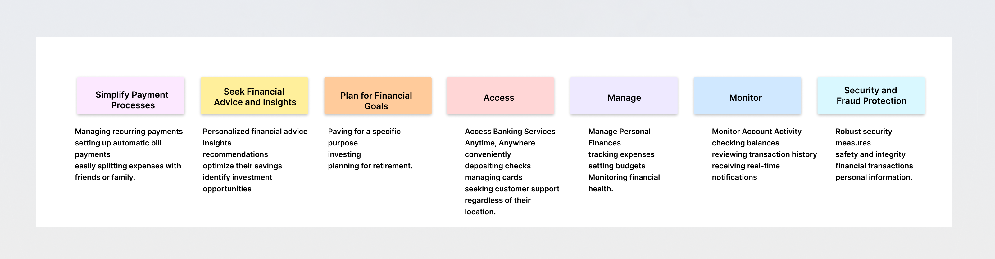
Andela Talent pool platform
DESIGN FOR PWA & MOBILE WEB · USER TESTING · RESEARCH
Problem statement

skills and career path. A developer can request a mentor and a mentee has to accept the request for learning mentorship. Developers can add learning resources approved by a learning Facilitator, the facilitator supervises and approves learning progress. This is later shared with the Andela partners showing which developer has specific skill they are looking for.

My Contributions

Responsible for research, conceptualisation, design, user testing and delivery of key modules and feature areas..

Team

4 designers, 3 product managers and 15+ engineers.

Discovery - Research Goals

Research existing travel industry to gain insight into what type of customer buys travel online.
From those results, determine who would use this service.Using current travel sites as a starting point, find out what users’ pain points are when booking conventional travel.
Validate (or invalidate) our assumptions and come up with a hypothesis and problem statement. (What problem are we trying to solve?)
    Participants

  • Gender - A total of four women were interviewed.
  • Age - Two @ 28 years old (Millennial) - One @ 44 years old (Gen X)
  • Employment - Two employed full-time - One part-time - One semi-retired
  • Income - Three upper/middle income - One < $10,000
  • Education - Three Bachelor's or higher - One Associates
  • Location - Three in Arizona - One in California
Key Insights

  • Find out how people prefer to schedule appointments and why.
  • What motivates people to go to a spa website.
  • What kind of environment do people expect to find in a spa.
  • What kind of information people look for on a spa website
  • What the primary reason is for going to a spa website.
  • Find out more about the industry and industry trends.
  • What are some of the pain points people experience on spa websites.
  • Persona

    Who are we solving for?

    Meet Jessica, an educated, 30-something, single professional who is interested in new types of travel. Where did Jessica come from? She is a direct result of the interviews and survey results collected during the research phase of the project. While conducting the interviews, I noticed some patterns that began to form. I took those patterns and organized them using sticky notes and analyzed them. It was from this that the archetype of Jessica emerged.

    USER JOURNEY

    🤔 Understanding how, what and when people search on Outlook mobile.

    THE PROCESS

    🤔 Bucketing user jobs into the stages of the user journey

    User jobs from the Jobs-To-Done exercises helped us see patterns and map out the user journey into seven broad buckets. For the MVP we ideated concepts under each of these buckets.

    Prioritization

    🤔 Determinng Impact vs level of effort using Eisen Hover Matrix

    Now that I have a basic understanding of the IA structure, I quickly ideated/brainstormed some design ideas. Here, I started with just the homepage in order to get a sense for where the major elements might fall on the page, keeping it very loose with the understanding it will change. The client liked the direction we were going in and I began to develop other pages in this way.

    Sketches

    🤔 High level ideation and brainstorming desing ideas

    Now that I have a basic understanding of the IA structure, I quickly ideated/brainstormed some design ideas. Here, I started with just the homepage in order to get a sense for where the major elements might fall on the page, keeping it very loose with the understanding it will change. The client liked the direction we were going in and I began to develop other pages in this way.

    Design

    🤔 Low Fidelity Wireframes

    These low fidelity wireframes take everything up to this point and organizes the information architecture into something more visual. I used the card sorting and the site map artifacts to help with this task to map out the main screens. I started with the desktop version. The numbers show annotations where interactions that are not obvious require some explanation.


    Feedback & iterations

    17 teachers responded out of the 30 pilot teachers. In general, they loved this new feature because they could see all the information at once. One teacher said:

    "I loved that it gave a quick overview of who is doing what work, and the %. This is SO HELPFUL for me as a teacher in many ways. I can see the progress of individual students, determine how to group students/differentiate quickly. This can also make it simpler for me when it comes to putting work in the grade book. It's amazing!”

    Key insights

    • I like that I can see how my class is doing at-a-glance! 7 teachers mentioned their love for the color-coding.
    • I like that I can easily find struggling students.
    • I like that I can use it for grading.
    • I wish I could filter by date.
    • I wish I could see a single student’s progress

    CREATING COMPONENTS AND STYLE GUIDE

    🤔 Design systems & resusable components

    Teamwork. Collaboration. Scalability. Unified. Style Consistency

    High fidelity Prototype

    Outcome

    This feature was very successful and has an NPS of +51%! The number of monthly very active learners with a teacher increased by 45%. 75-80% of monthly active teachers created an assignment within the last 28 days. Our original goal was 65%.

    .

    Usability Testing

    What's next?

    Participants
    • 24 total test subjects
    • 3 in person (All female)
    • 21 remote, unmoderated
    • Test Objectives
    • Determine the ease at which users can navigate through the website to accomplish their task, which will be to book a particular service.
    • Observe how users searched for and found the service.
    • Observe which method the user used to book their appointment (There is more than one way to book.)
    • Test the overall ease of use of navigating the website.
    • Observe any frustrations or obstacles users may have that may impede their ability to complete their task.
      Test Summary
    • In Person Testing
    • Users had very little trouble completing the task asked of them.
    • Difficulty in reading some text
    • Minor concern over photos subject matter
    • HIgh praise for color palette/brand

    Developer platform

    Designing an SaaS tool to visualize and manage complex organizations.

    View Case Study

    Travel readiness

    Redesigning the landing page for a German legal tech startup.

    View Case Study