01
Preserve the student in you
Study visual trends and technological shifts. Follow your industry leaders. Read widely and build a rich pool of inspiration — then let it ferment before you pour it into your work.
02
Do your research first
Understand the business model, then understand its users. Map their pain points. Solve for people while pushing measurable business goals — both at once, never in sequence.
03
Learn from the best
Benchmark every project — it surfaces best practices and sparks ideas. But don't just replicate your heroes. Synthesise what you learn and find your own voice.
04
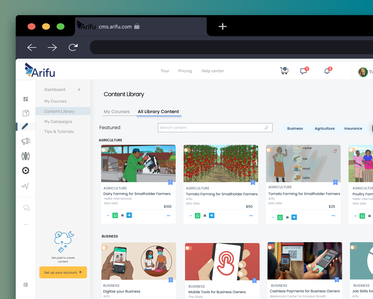
Keep it simple
Simplicity is hard work that always pays off. Pursue the unexpected, intuitive solution. The best interface is the one the user never has to think about.
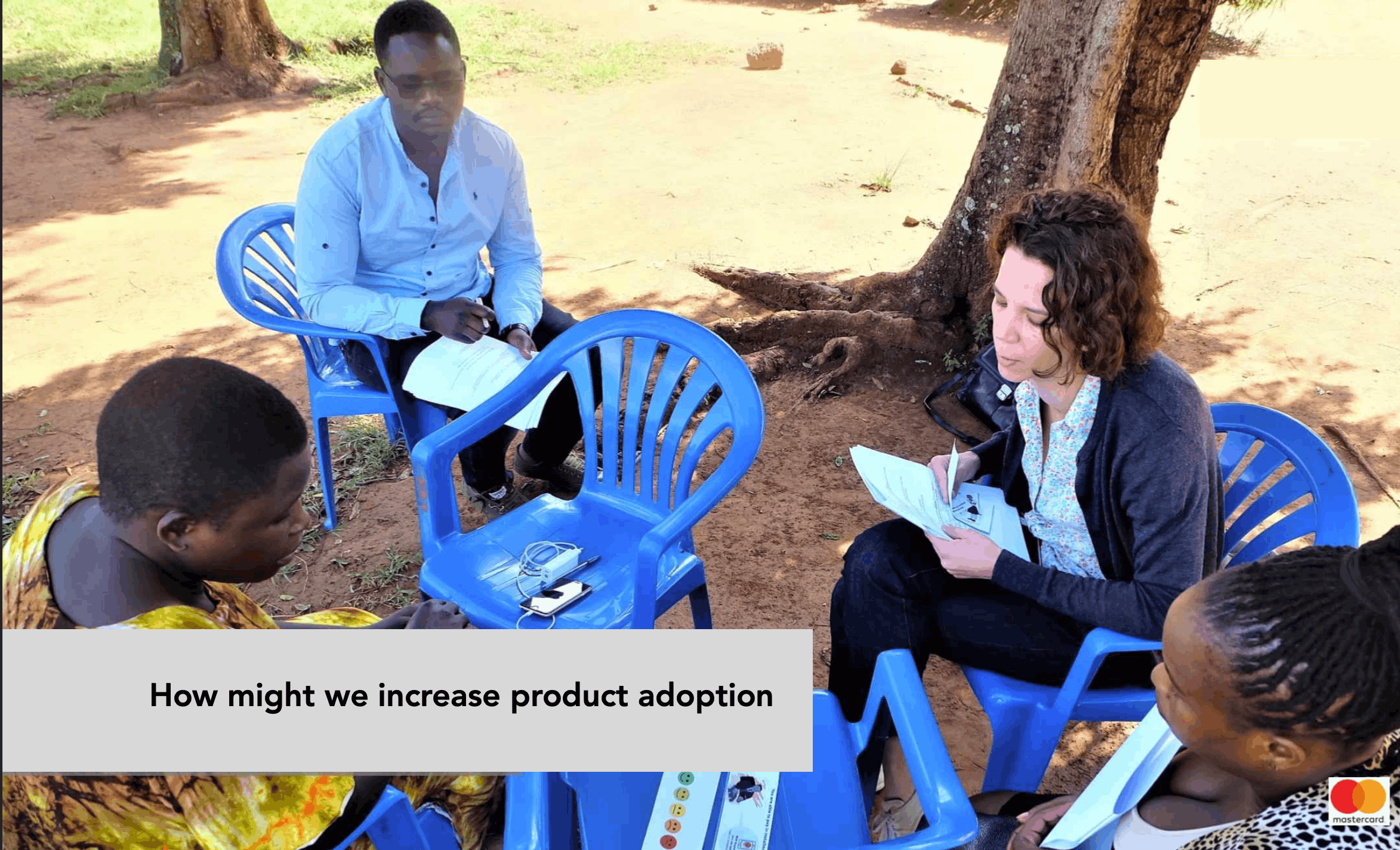
05
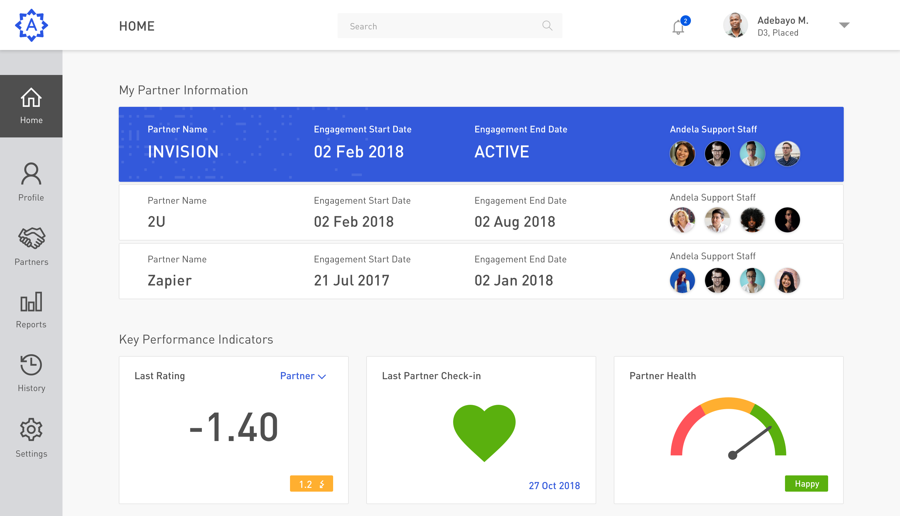
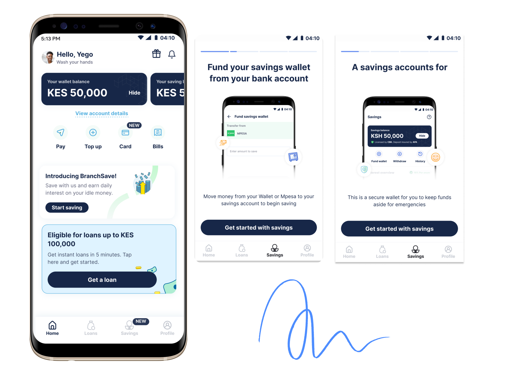
Don't trust just yourself
Prototype early and test under near-real conditions. Listen more than you talk. Don't defend features you love if users don't get them — let the data decide.
06
Think holistically
Design systems, layout grids, pattern libraries — these aren't overhead, they're the foundation. Consistency across touchpoints is how products earn trust at scale.