Context
Andela places vetted African engineers inside partner teams globally. By 2018, the trust problem had shifted: the talent was there, the partners were signed — what was missing was a reliable signal. Partners couldn't see how their developer was performing without requesting a status call. Developers had no structured feedback loop to know where they stood. Technical Success Managers were answering the same questions by Slack instead of pointing to a shared source of truth.
The Developer Performance Report was the answer: a recurring, multi-channel artefact that gave partners like InVision real-time visibility into developer contributions, work patterns, peer positioning, and growth — and gave developers a structured view of how they were perceived and where to focus.
Partner email report
A weekly digest giving partner companies a scannable read on contributions, work log, breakdown by category, and developer updates — without requiring a call with a TSM.
Web dashboard
A persistent full-detail view with scatter plot peer positioning, commit risk distribution, work focus breakdown, and partner feedback history — designed for quarterly review conversations.
Developer email view
A parallel email variant — same cadence, different data payload — surfacing peer benchmarking, commit risk, and focus breakdowns the partner never sees, giving the developer a private growth signal.
Email v2 — progressive variant
A second partner email variant that withheld percentage labels from work breakdown charts, replacing bars with ring charts to drive click-through to the full web dashboard.
Approach
Two audiences, three channels, one visual system. Rather than designing each email independently, the work started from a shared question: what does a partner actually need to see to feel confident in their engagement — and what does a developer need to see to know what to improve? Those are not the same answer, but they share the same data underneath.
The design challenge was segmenting that data cleanly at the content level, not just at the UI level — so a partner never sees raw peer-positioning data that could undermine confidence, and a developer always gets the specific, actionable signal that their partner summary intentionally omits.
Segment audiences
Mapped partner and developer information needs side by side — then defined which data blocks appear where, and which are deliberately withheld from each view.
Design the web view first
The full dashboard carries every data point. Email variants were derived from it — not designed separately — so the visual grammar stays consistent across surfaces.
Build two email variants
v1 uses bar charts to show work breakdown percentages directly. v2 replaces them with ring charts — withholding numbers to test whether ambiguity drives click-through to the web view.
Test with partners
Walked partner contacts through the rating flow and the full email end-to-end, watching where they paused, asked questions, or defaulted to ignoring a module.
Web dashboard — partner view
The full-page web dashboard is the source of truth for the partner engagement. It opens with an identity header — developer photo, partner logo (InVision), start date, level, and location — then sequences through Contributions, Work Log, Snapshot, Commit Risk, and Focus in a single, vertically scannable layout.
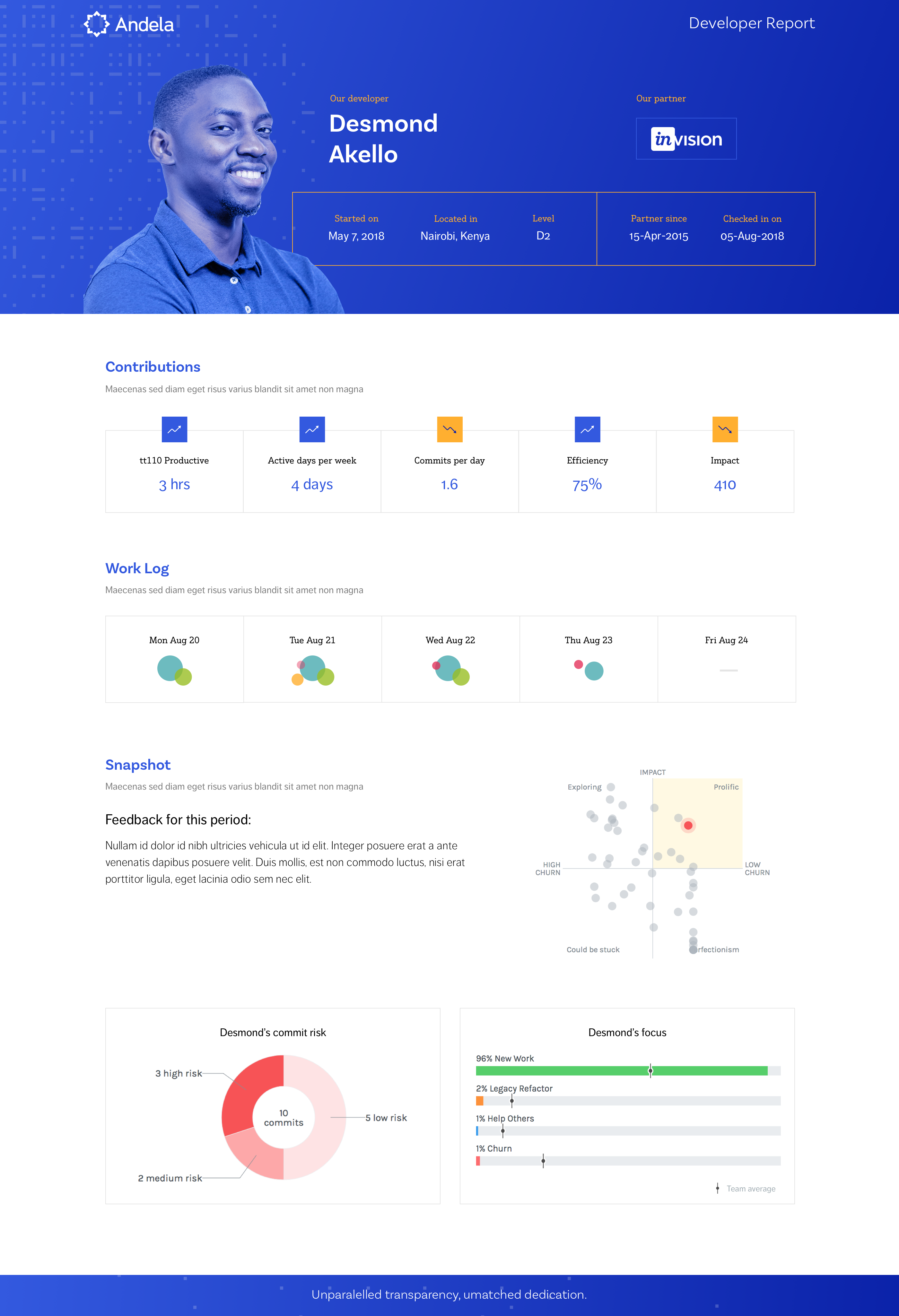
FIG. 01 — Partner web dashboard: identity header, five data modules, and peer positioning quadrant
The Snapshot module does the most interpretive work. A quadrant scatter plot positions Desmond against anonymised grey dots representing peers on an Impact vs. Churn axis, with labelled quadrants — Prolific, Exploring, Could Be Stuck, Perfectionism. The partner sees relative positioning without needing to understand the underlying commit metrics; the quadrant language turns a data visualisation into a coaching frame that any non-technical CTO can read in seconds.
Below the quadrant, Commit Risk is shown as a donut centred on total commit count — 10 commits, broken into 3 high-risk, 5 low-risk, 2 medium. This framing was deliberate: a traffic-light system would produce anxiety, a donut produces distribution. The partner sees nuance, not a verdict.
Partner email variants — v1 & v2
The weekly partner email needed to work in constrained, low-attention conditions — a two-minute read between calendar gaps. Both variants open with the same five contribution metrics (tt110 Productive, Active Days, Commits/Day, Efficiency, Impact), the daily Work Log bubble visualisation, and an Updates section capturing the developer's own accomplishments, next steps, and blockers. Where they diverge is in how they show work breakdown data.
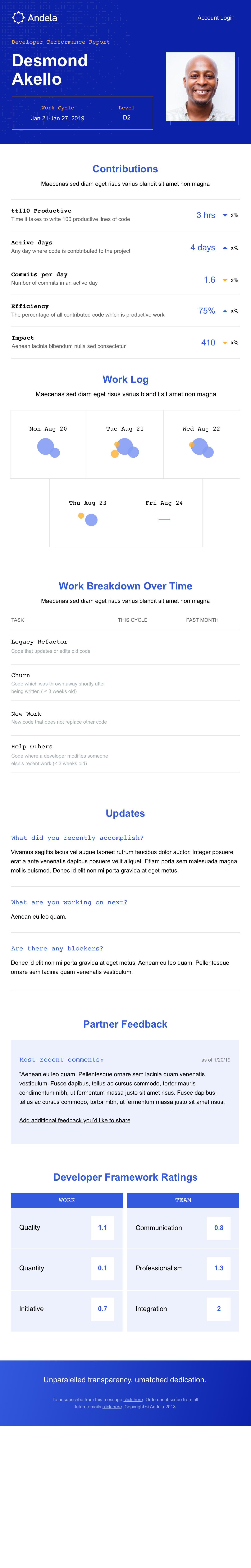
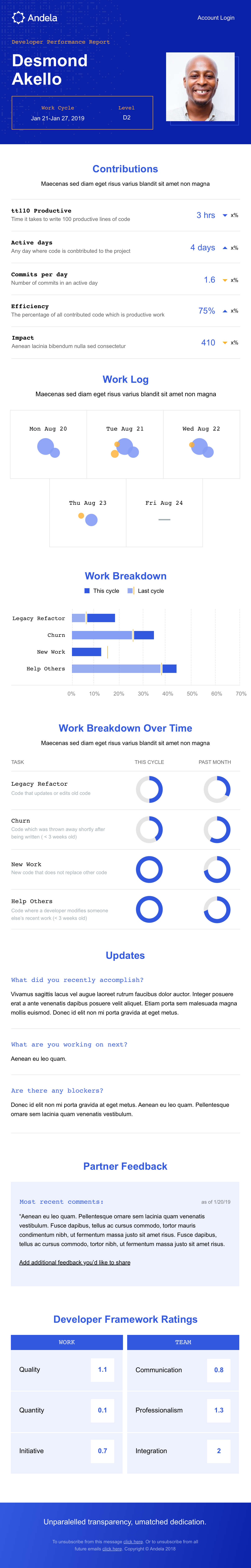
FIG. 02 — Partner email variants: v1 (explicit percentages) vs v2 (ring charts that withhold numbers)
Email v1 shows work breakdown as horizontal bar charts with percentage labels — Legacy Refactor, Churn, New Work, Help Others — compared against the previous cycle. Partners can read the full distribution without leaving email. Email v2 replaces those bars with ring (donut) charts in the same positions but removes the percentage labels, creating deliberate visual ambiguity. The hypothesis: a partner who can see the shape of work breakdown but not the exact numbers is more likely to click through to the full web dashboard to complete the picture.
Showing everything in the email answers the question before we can have the conversation. The ring charts make partners curious — they click through, and that click is the beginning of an actual engagement review.
— Design rationale for Email v2 variantBelow the work breakdown, both email variants include a Partner Feedback callout — the most recent written comments from the partner's previous rating — and Developer Framework Ratings: a two-column grid (Work / Team) with numeric scores for Quality, Quantity, Initiative, Communication, Professionalism, and Integration. This closes the feedback loop in both directions: the partner is reminded of their own prior input, and the developer sees their current standing in the email they receive.
Developer email view
The developer-facing email shares the same visual shell and opening modules (Contributions, Work Log) as the partner email, but carries a substantially different data payload from the Snapshot section downward. What the partner sees as an anonymised peer cloud, the developer sees as their named position on that same quadrant — with the Commit Risk donut and Focus bar chart added, giving them the two pieces of data most actionable for self-improvement.
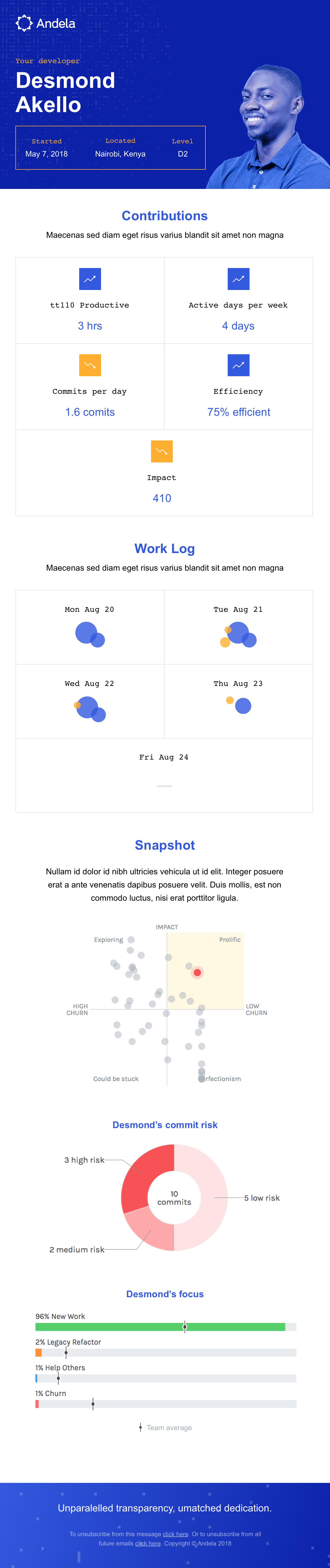
FIG. 03 — Developer email: same cadence as the partner report, private peer-positioning data
- Confidence the developer is active and productive
- Comparison to prior cycle, not just raw numbers
- A narrative — what was accomplished, what's next
- No raw peer data that might create anxiety
- Specific, actionable feedback beyond a number
- Peer benchmarking to understand relative standing
- Commit risk breakdown to know what to change
- Focus data compared to team average
- Shared visual shell, divergent data payload
- Segment at content level — same component, different blocks
- Quadrant + donut in developer view only
- Partner Feedback section in partner view only
Design decisions
Six choices that distinguish this system from a generic analytics digest.
Partner and developer emails carry different data payloads — not just different UIs. The split is structural, enforced at the content block level.
Colour-coded daily bubbles (blue = churn, amber = help others, red = legacy) are intuitively scannable in email without reading axis labels.
Peer positioning as labelled quadrant turns a scatter plot into a coaching frame any CTO can read. "Prolific, Low Churn" is a conversation starter, not a metric.
Commit risk as a distribution (3 high / 5 low / 2 medium) avoids binary red/green anxiety. The partner sees nuance; the developer sees what to fix.
Three recurring questions — accomplished, next, blockers — give partners language for weekly standups that pure metrics never could.
Ring charts without labels create productive curiosity in email, driving click-through to the web view where the full picture lives.
Outcome
Three delivery surfaces — partner email, developer email, web dashboard — shipped from a single visual system. The shared component grammar (bubble work log, donut charts, metric rows, contribution stats) meant partners moving between the weekly email and the quarterly web review recognised information instantly, even though the data payload was different each time.
The audience-split model removed a recurring class of TSM work: partners no longer needed a call to know if their developer was productive, and developers no longer needed to ask their manager what their partner thought. The report closed both loops on a weekly cadence without introducing anxiety — the same underlying data, framed appropriately for each reader's needs and relationship to the information.
- Full-page partner web dashboard with 5 data modules
- Partner email v1 — bar chart work breakdown
- Partner email v2 — ring chart A/B variant
- Developer email with peer-positioning data
- Shared component grammar across all surfaces
- Audience split at content level, not just UI
- Quadrant language over raw scatter plot axes
- Donut distribution over traffic-light risk signal
- Updates section as narrative, not filler
- Productive ambiguity in v2 to earn the web visit
- Partners self-serve performance confidence weekly
- TSMs no longer field status-update Slack messages
- Developers get actionable peer benchmarking privately
- Partner feedback loop closes without a TSM in the middle